I know I've been awful at the whole blog thing lately. I promise it's just because I've been very busy. One of the many things keeping me stuck inside, is this Businessweek cover I did. HOLD YOUR APPLAUSE, sadly it didn't make the final cut, and after seeing the headline they went with I completely understand. This image has a very different feel to what ended up running. I'm not too disappointed though, it was a REALLY fun project to work on! I learned a lot about how I work best when under pressure. Thanks to Creative Director Richard Turley for the opportunity, and hopefully I'll make the cover next time!
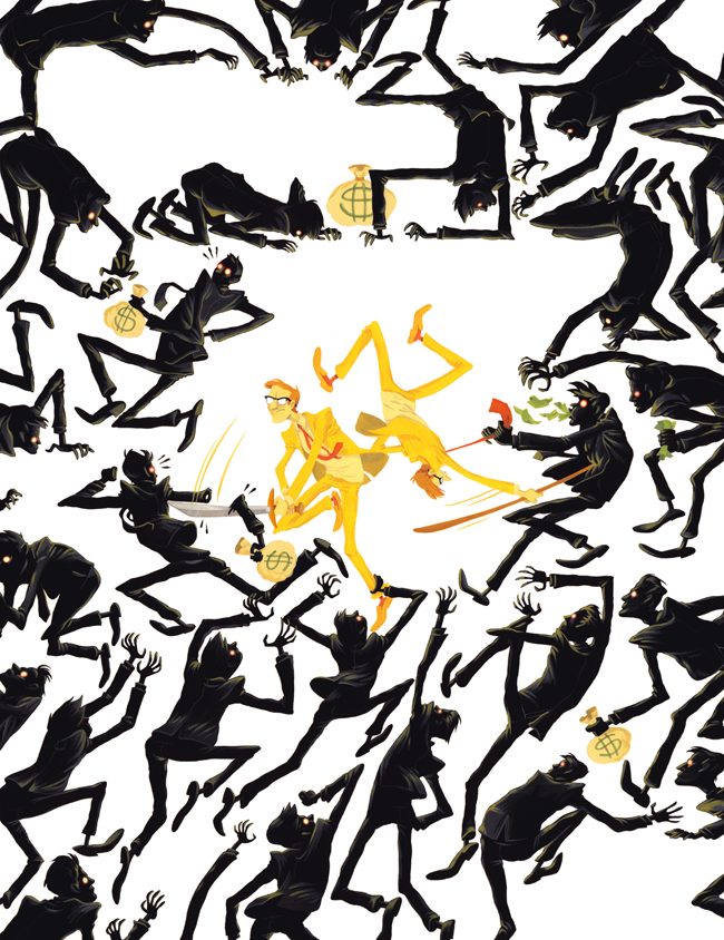
Here's sorta what it would look like cropped, sans text. The upper hole is for "BLOOMBERG BUSINESSWEEK" and the awkward space around the center figures was for the headline text, which they didn't have yet, so it was very hard to plan for.
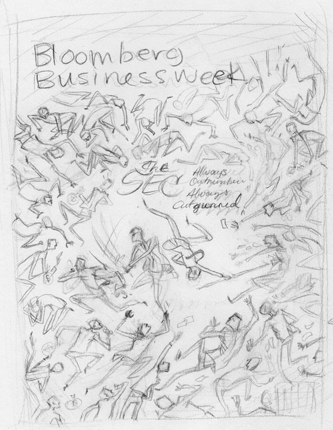
The thumbnail:
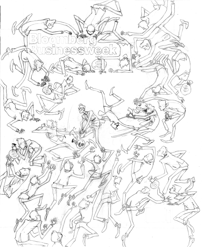
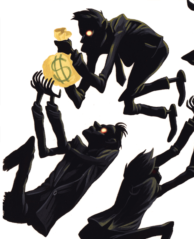
Final drawing:
This is the full painting, with all the bleed. There's some awesome stuff that I knew was gonna be cut off, and I JUST DIDN'T CARE.

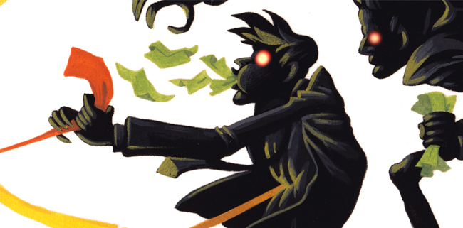
And here are some close ups for your eyelooky pleasure.

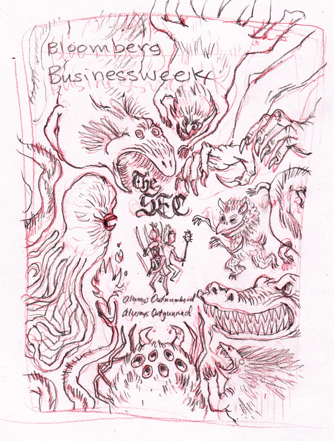
Here are some of the preliminary thumbnails and sketches.


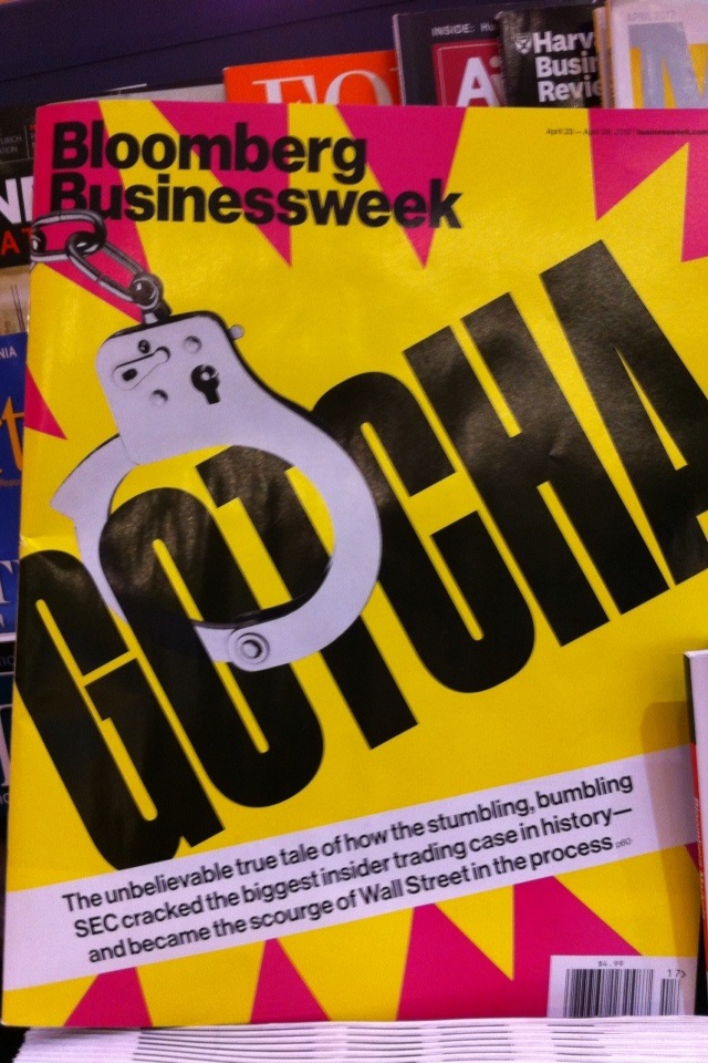
And here's what they actually ran.

I LOOOOOVE IT!! It would have been an amazing cover. I also love the snake sketch, I think you should finish that one with ladies in the middle. You'll get it next time Britt.
ReplyDeleteWow, it's a shame they ran with what they ran with, because you made a great cover.
ReplyDeleteWould you possibly sell print of that? Its pretty boss I was kind of awe struck when I saw it.
ReplyDeletefantastic work britt. i LOVE the way you rendered the reflective light on the "black" guys
ReplyDeleteSimply delightful.
ReplyDeletefrankly, we should have gone with your one! it was better!
ReplyDeletehindsight...
Richard T
absolutely beautiful!
ReplyDeleteThanks, Richard, but no, I really think that with that headline, assuming it sums up the intent of the article, definitely doesn't fit my final.
ReplyDeleteThat is just amazing, Britt. I love seeing snippets of your work and seeing a little of your process. What do you paint with?
ReplyDeletewow... who ever is calling the shots over there at that mag, needs to be fired. Each of those designs and sketches are great! The one they went with looks like a Hobo designed it. Barf.
ReplyDeleteRawls, it was really just a series of bad circumstances, the article was not, in the end, what we had thought it would be, and worked towards, and so my cover really didn't fit anymore. Weekly magazines have very quick turnarounds so everything is happening simultaneously. We'd been thinking that the theme was the insurmountable task of policing the Financial Sector that the SEC was taking on with limited resources. But the article ended up much more tabloid-like, and touted the recent success of the SEC in such a way that my design (though finished at this point) was no longer valid. A good painting can still be a bad illustration when used incorrectly, so though I'm disappointed I couldn't be on the cover, I very much agree with the Creative Director's, and Editor's (and whoever else was involved) decision. It also doesn't reflect very well on my cognitive abilities if another art director were to see my illustration and notice that it was off the mark. I believe the final cover was made with very short notice, and considering the time restrictions, isn't all that bad.
ReplyDeleteYour cover is sublime.
ReplyDeletelove it. So Kill Bill-y
ReplyDeleteHey Britt,
ReplyDeleteThis is AWESOME! LOVE LOVE LOVE so fun.
I'm super late but just had to say, you are stupidly good at what you do.
ReplyDeleteI especially like the sketch with all the Hensony-looking monsters